COMPANIES
Aiwa Kogei Co., Ltd.
Aiwa Kogei Co., Ltd. is a sign manufacturing company with a long history that began in 1968. In addition to indoor and outdoor sign manufacturing, we also handle booth setup at trade shows and events, woodworking, and event signage. Our strength lies in making strategic signs and external renovations with many years of accumulated knowhow, which helps clients increase sales. To ensure that we deliver effective signage solutions, we undertake a comprehensive analysis of each customer's trade area. This includes conducting on-site surveys to evaluate their business processes and actions. At every stage, we integrate the most relevant data into the signage to optimize its ability to guide customers and encourage visits. We strive to design signs that function like sales associates, strategically engaging with our customers.
Production Examples
-
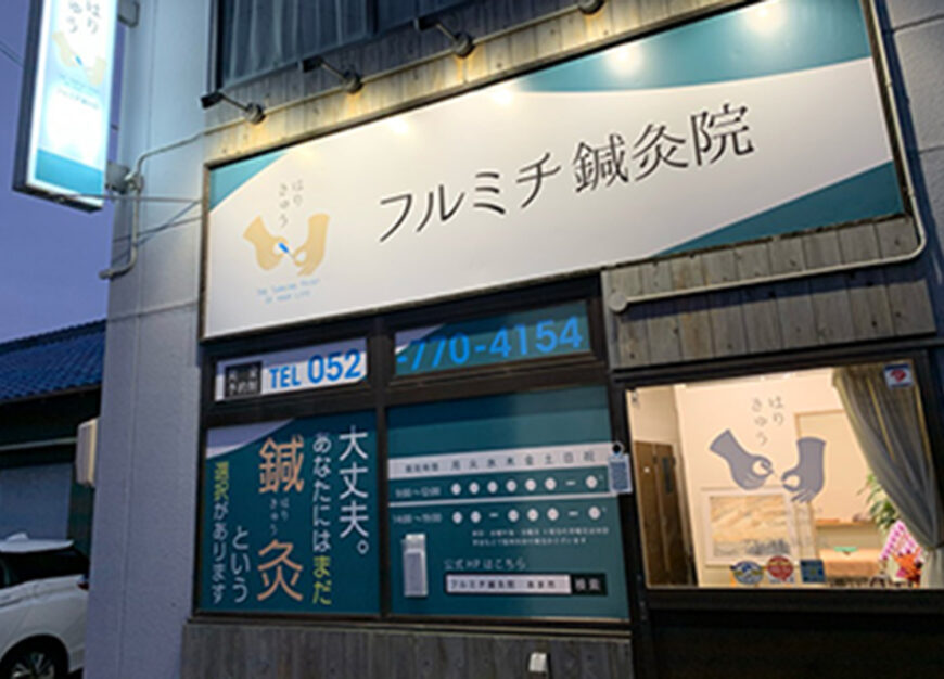
Acupuncture clinic as a turning point in life
We assisted the Sugiyama Clinic in Ama City, in Aichi, with signage renovation work following the renaming to the Furumichi Acupuncture Clinic. We started by creating a logo. As the target market is young women, we designed it from a woman's point of view so that they would find it easy to visit. We believe that the logo expresses Dr. Sugiyama's belief that "an acupuncture clinic can represent a pivotal moment in someone's life.”
-
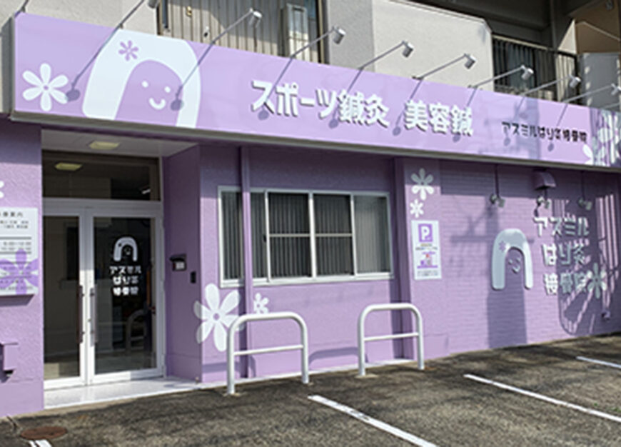
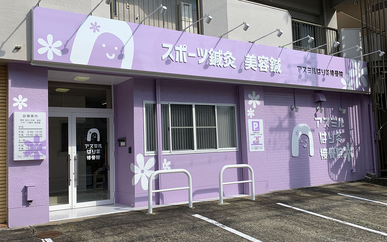
Exterior branding to liven up the city
The Asumiru Osteopathic Clinic specializes in beauty acupuncture for women, so in designing the color scheme and logo, we narrowed down the target to women, especially those who are interested in beauty. The location was originally an internal medicine hospital that opened more than 20 years ago, for which we renovated the exterior. It faces a street that runs from the Shiogama-guchi to the Yagoto areas in Nagoya, leading from a bustling student-oriented town to an elegant residential area with fashionable stores throughout. We believe that the clinic’s appearance blends in with the townscape while also standing out.
Although the advertising restrictions for a clinic do not allow for symptoms or prescriptions to be displayed on the sign, we proposed a design that would create colors and shapes that would impress the target demographic. -
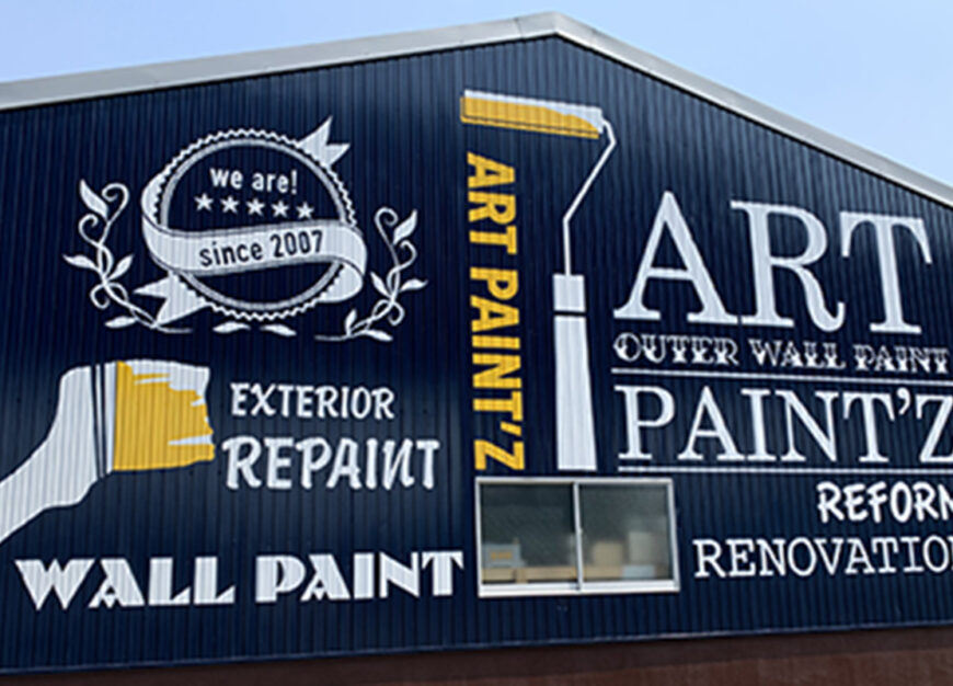
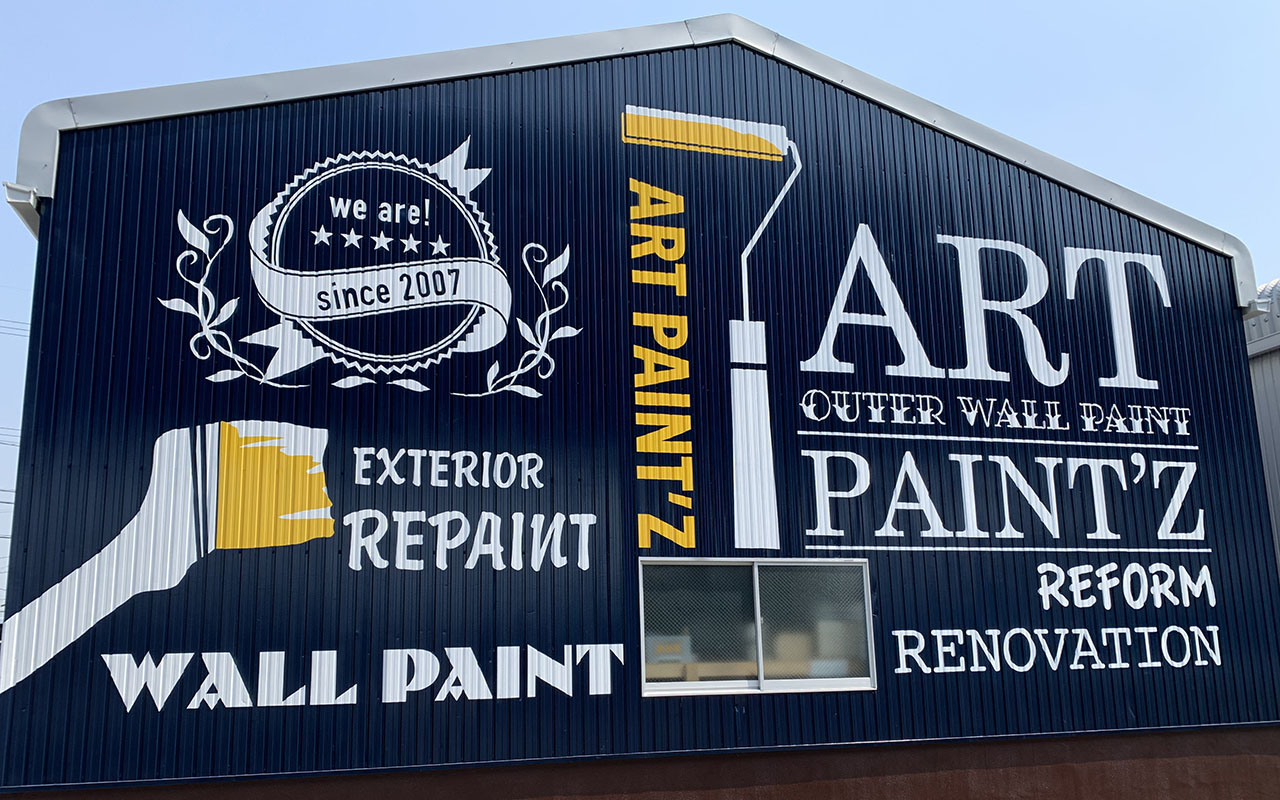
Created an artistic wall surface
During our meeting with “Art paint'z,” they agreed with our proposal to use the entire exterior as one big signboard, and this was a very enjoyable project for all of us to work on.
The exterior painting industry is locked in a strict price war, where many customers with no knowledge of exterior painting would not recognize the quality difference in paint and finishing techniques. However, it was different at Art paint'z, a company with "Art." The owner's studious and sincere personality allowed for a unique and special design that was not simply a repaint, but rather something with a little bit of vintage feel, that would give a sense of the effort and artistic creation. -
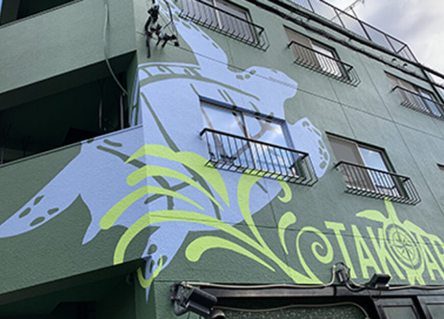
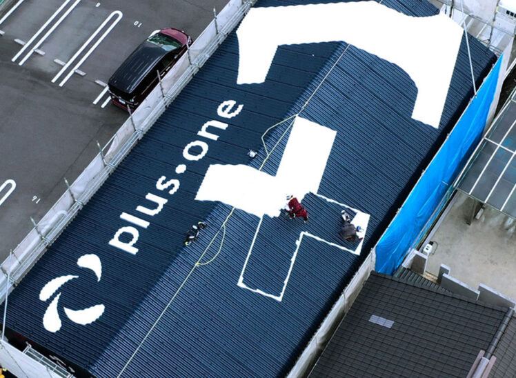
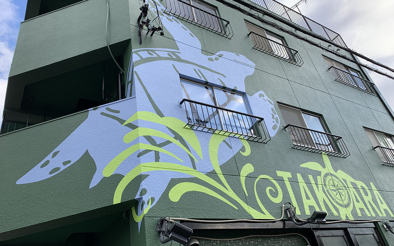
Large turtle illustration draws the attention of people on the street!
We assisted in creating the exterior of TAKARA Corporation, which relocated its headquarters to Nakamura Ward in Nagoya. The company performs exterior wall repair work and various types of waterproofing, with both the passion of its young president and its own proprietary technology.
“Turtle” was chosen because of the animal’s longevity and good luck and a compass was added to the turtle's belly in the mural as a nod to the fact that turtles can swim across the world's oceans and always find their way to their birthplace. Since this is a BtoB company, the aim was not to appeal to end-users. We would rather see this building become a landmark in the area so that people passing it would see it and remember, “Oh, that’s the turtle building!” -
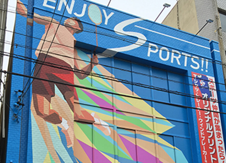
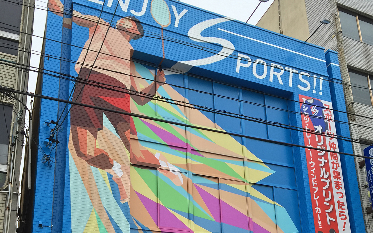
SATO SPORTS’ exterior renovation
Sato Sports, an old sporting goods store in front of Nakamura Koen Station in Nagoya, Japan requested us to renovate the exterior of their store upon their shop renewal.
Prior to the renovation, the store had deteriorated considerably in terms of both the walls and signage, with the appeal of the signage having completely faded. The area also generally had a gloomy atmosphere due to the overall deterioration of the surrounding storefronts.
That was why we decided to boldly highlight the store in a bright blue color. This has greatly increased the store's appeal as well playing a role in community revitalization by brightening the area itself. However, since people tend to dislike overly-flashy colors, we kept a balance of conspicuous but not too outrageous colors by unifying them with a refreshing, sporty color in the sky blue range.
Company Profile
| Company Name | Aiwa Kogei Co., Ltd. |
|---|---|
| Founded | 1968 |
| Capital | 10 million yen |
| Head Office | 183, Miyatsuka-cho, Nakamura-ku, Nagoya, 453-0845 Japan |
| Representative | Takeshi Yokochi, President |
| Number of Employees | 9 |
| Business Activities |
Products and services for sales promotion in various stores 【Services】 ・Exterior renovation ・Signboard production: Facade signs, Road signs, Project signs, Stand signs, Suspended banners, Tents, Car markings, etc. ・Trade show and event setup ・Sign painting ・Production and installation work ・Strategic design ・Trade area analysis and site surveying |